Referral Program Optimization
Optimization recommendations designed to help you take your referral program to the next level.
Your referral program is up and running -- which is awesome! -- but where do you go from there?
The following recommendations are a great resource to improve your referral program’s participation and drive better results.
🔗 Widget Visibility
For most referral programs, the Referral Widget is the main point of interaction for your existing users. This widget allows your end users to make new referrals, track the status of in-progress referrals, and lookup their outstanding reward balance. SaaSquatch offers two types of referral widgets--verified access and instant access. See our doc on widget types for more information.
A simple way to make sure more of your users are exposed to the referral program, and thus have the opportunity to share their referral, is to display the widget prominently throughout your product.
Our JavaScript library can display the widget any number of times throughout your website. With this flexibility we recommend that in order to maximize exposure that the referral widget is placed in a static location, as well as exposed at a number of strategic points throughout your end user experience inside your product or service.
🔗 Static Location
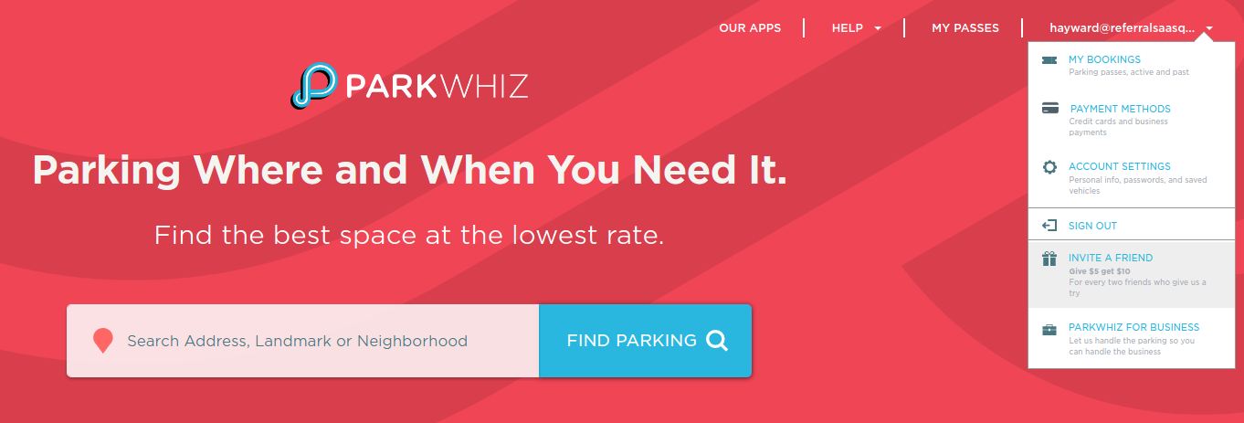
The ability for your users to always be able to find the widget within your product is key. A great way to do this is to have a permanent location within your product where your users can always find the widget. This way a user will always know where to go if they want to make another referral or check on their progress.
Some examples of great places to permanently surface the referral widget are:
- A link from the top navigation bar to a specific page
- As a popup from the links in the footer of your page
- A menu item within the user’s account settings.
🔗 Strategic Positioning
In addition to a static widget location it is good to expose the user to the referral program at key points throughout their use of your product. In many cases these points are “Happy Moments”, which will be discussed in further detail in the following section.
🔗 Happy Moment Engagement
As a user progresses through setting up and using your product they will be completing certain key milestones, which we call “Happy Moments”. These Happy Moments relate to the idea that while the end user is interested in, engaged with, and excited about your product, it would be a great opportunity to entice them to make a referral. We can entice them to make that referral by exposing the Referral Widget to them as they complete this Happy Moment.
Some examples of Happy Moments that can be great places to expose the referral program might include:
- Account Creation - The user has just been welcomed to your product, so why not let them share with their friends how frictionless the signup experience was.
- Checkout thank you page - The user is excited about having just completed a purchase of your product. Their interest and dedication to your product means this is a great time to get them to share that excitement with their friends.
- Completed Tasks - Plan upgrade, billing information update or usage milestones; all of these events are places where you could entice the user to share their experience using your product.
🔗 Transactional Email Links
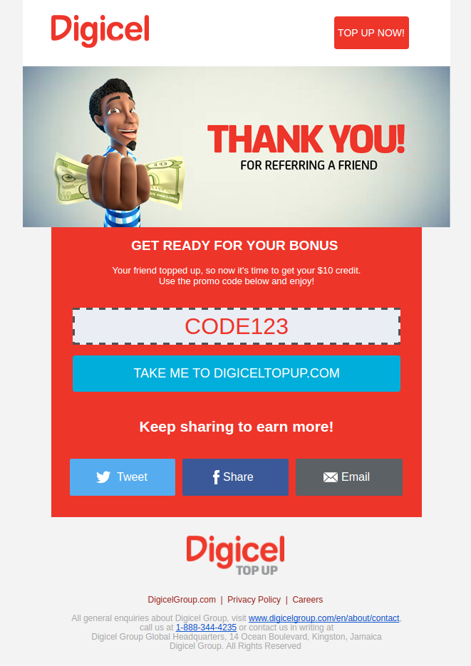
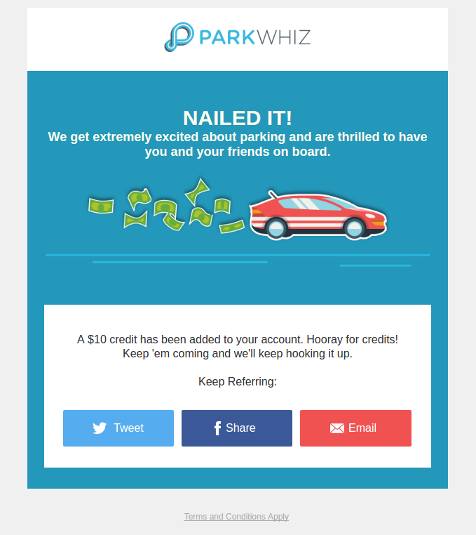
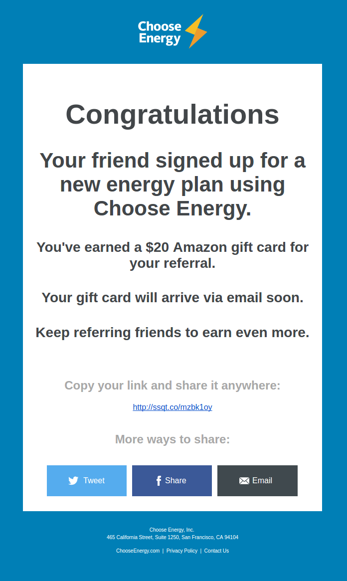
It’s quite likely that you already send your customers quite a few transactional emails; like Password Reset emails, order confirmation emails, and Account Update Notification emails. These types of emails are a great opportunity to get your users to engage with the your referral program.
Referrers that have successfully started or completed a referral already receive email updates from SaaSquatch on your behalf notifying them of their progress towards receiving their reward. In these emails we include links for them to make additional shares through email, Facebook, or Twitter.
This sharing functionality can be included in your transactional emails in a similar way. Every user in the SaaSquatch system has their own set of unique sharelinks which you can provide to them in your transactional emails to share with their social circles. These sharelinks can be retrieved from the SaaSquatch system programmatically through our API, or through our reporting feature in the SaaSquatch Admin Portal to be imported to your email service of choice.
As transactional emails almost always contain key information that the user is interested in reading, they provide a unique opportunity to grab the user’s attention and channel it towards sharing out their experience using your platform.
🔗 Personalized Landing Page
Making sure that the messaging presented to the referred visitor is simple and provides all the information they are looking for about the referral helps minimize the chance of them abandoning the sign up process.
This means that while directing referred visitors through your standard landing page and signup flow is a good way to get your referral program up and running quickly, it provides little additional value for the referred visitor.
The best way to go about customizing the referred visitor experience is by creating a customized landing page experience for your referred visitors.
In order properly convey this message we recommend to include a few key pieces of information:
- A message welcoming the referred visitor to your product
- A reminder about who referred them
- Reiteration of the reward they will receive for being referred
- An explanation of how they will receive this reward
By outlining how the program works, it can reduce friction during the sign up process and limit any potential questions your Customer Success or Support Team might receive in regards to the sign up process and how they will receive their reward.
An easy way to get started with a customized referral landing page is to utilize our Referred User widget. This widget enables you to provide all the of key information the referred visitor needs to know, and can be configured in minutes by simply dropping a code snippet onto the landing page. This can be done on top of your existing lead capture landing page, and will only display the Referred User widget to users who followed a referral link to your site.
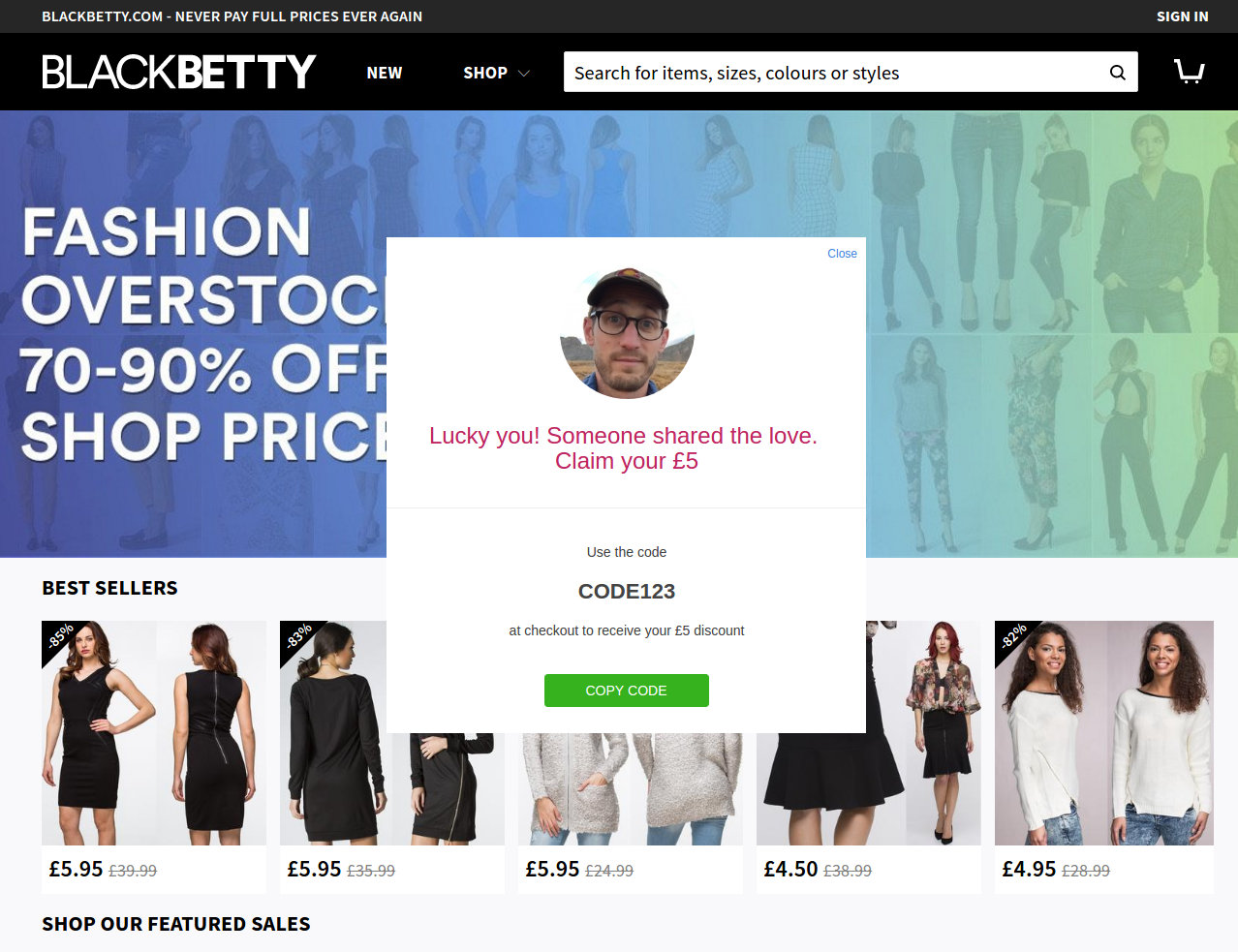
A more customized implementation would be to create a separate referral program landing page.
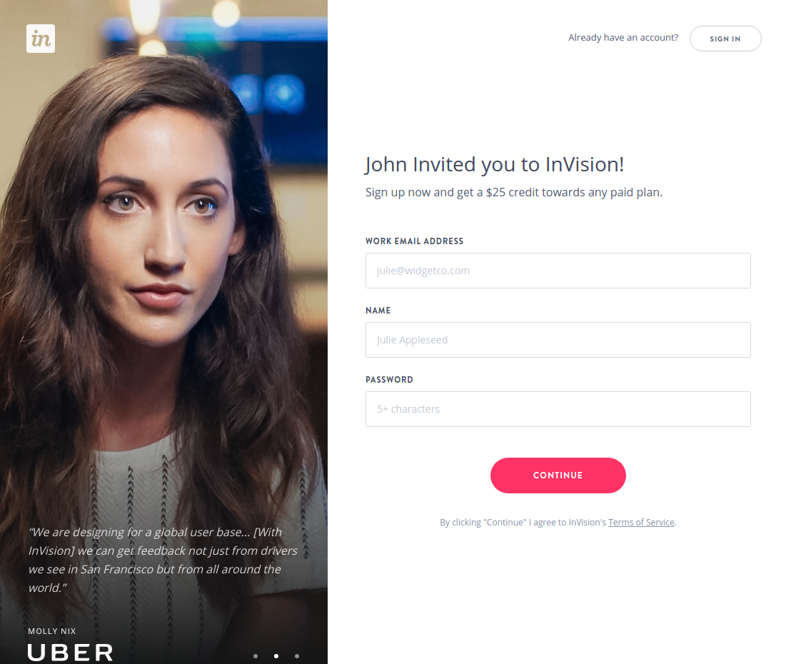
Multiple website platforms, like HubSpot, provide the ability to create a number of different landing pages, one of which you can configure for your referral program.
🔗 Keep It Simple!
Keeping everything extremely simple is of the utmost importance when it comes to running successful referral programs. If a participant has to read through your offer a number of times to understand your referral program they will often think it’s too much effort, and will simply move on.
The core program information that needs to be conveyed clearly can be broken down into three primary categories:
- Reward Structure - Details about the type of rewards that the Referrer and Referred User will be getting for their participation.
- Referrer Messaging - Information about the referral program and process designed to entice existing customers to share out their referral. The Referral Widget is a great place to outline this information.
- Referred User Messaging - Information about your business and product offering intended to incentivize new users to sign up for your product. We recommend using the customized landing page outlined above to communicate this to the Referred User.
🔗 Reward Structure
SaaSquatch provides the ability to offer each referral program participant one of a number of different types of rewards.
The details of what this reward structure will be is highly dependant on the specifics of your business, but in general, there are two core concepts when it comes to picking the right reward structure for your program: Target Audience and Incentive.
🔗 Target Audience
Depending on whether your business is B2B or B2C, this delineation will have a significant effect on the type of reward that is best to offer your referral program participants.
In order to offer the best program incentive it is best to understand exactly who you are trying to target with your referral program.
Referrer:
Are you trying to engage all of your existing users, or only a subset of your userbase?
Targeting customers on a specific tier plan, those who have made X number of purchases, or those who have completed some other specific activity within your product are all good ways to select what segment of your users you want to entice to make referrals.
These different segments of your customer base will be looking for different types of rewards so knowing what segment you want to enroll into your referral program will drive better participation and help determine what reward to offer.
Referred User:
Are you trying to reach out to a new customer segment, or drive more traffic among a segment you already attract?
Different segments of potential customers will be motivated to sign up and pay for your service for a number of different reasons. Picking a target segment, and understanding their specific motivation will help decide what you should offer them as an incentive.
🔗 Incentive
The type of Referrer and Referred User you target will shape the incentive combination you offer.
Your SaaSquatch program can be configured to offer account credit rewards, percentage discounts, time credits, giftcards, or rewards of nearly any other unit you can think of (like T-shirts). With so many possible reward options, there exists a lot of flexibility when it comes to what to offer as a referral reward.
🔗 Account Credit & Percentage Discounts
Account credit and percentage discounts are great rewards to give to a Referred User in a B2C referral program, as these users are typically very price sensitive and a discount on their first purchase is a good way of getting them to signup for your service.
Recurring percentage discounts are also a great reward to offer Referrers who are on a subscription where they can refer people to reduce their monthly bill.
🔗 Giftcards
Everyone likes giftcards as people can use them to purchase a product of their choice from their favourite retailer. Giftcards are a great way to give out a reward that speaks to a wide range of types of people.
Giftcards are particularly great as a reward to give out to Referrers in a B2B referral programs. A user is much more likely to make a referral if they will personally get a giftcard rather than saving on their company's monthly subscription.
🔗 Referrer Messaging
When a Referrer is looking to share out their referral they need to understand the steps people they refer have to follow in order for everyone to earn their reward.
Key questions that the Referrer will want to understand may include, but are not limited to:
- Does the Referred User need to include any additional information at signup so you know who referred them?
- Does the Referred User need to pay for a certain plan to be eligible for a reward?
- Is there a minimum period the Referred User needs to be a paying customer for before the Referrer earns their reward?
Making sure this information is easily available, and clear to understand will keep your Referrers informed and more likely to make more referrals in the future by reducing friction.
🔗 Example Messaging to Referrer:
"Refer your friends to Company X. They get $10 off their first purchase, and you get $10 when they make their first payment!"
🔗 Referred User Messaging
The messaging in your referral program that is directed at the Referred User will be what entices referred users to sign up for your service. This messaging needs to convey a quick overview of your business/product as well as the reward they will receive for participating.
When the Referred User sees the referral offer from their friend they need to understand:
- What your product or service is
- Why they should be interested
- What reward they get for being referred
- What they need to do to get that reward
This messaging should be kept as simple, clear, and straightforward as possible. Messaging longer than a sentence or two means that your referral program structure is probably too complex, and will turn people away.
🔗 Example Messaging to Referred User:
"Looking for a tool that does Y? Check out Company X! Sign up using the link below and get $10 in credit towards your first purchase."
🔗 Conclusion
Launching your referral program is only the first step in the lifecycle of your referral program.
As more and more referrals come through your program you will get insight into its strengths, and areas that could use some improvements. Additionally, as your business evolves, and priorities shift, your company's needs from the referral program will change as well. With each of these scenarios, your SaaSquatch referral program is fully capable of accommodating these improvements and optimizations.
The types of optimizations outlined in this article are only a selection of the possible adjustments you can make to your referral program. Each business is structured differently, and is looking for different things from their referral program. Please feel free to reach out to our Customer Success team if you have any additional questions about how to get the most out of your referral program.
