Customizing Program Widgets
🔗 Overview
SaaSquatch by impact.com offers a pick-and-plop editor that allows you to customize the look and contents of the widgets presented to your participants.
🔗 Access the widget editor
- From the Admin Portal, go to the Content page.
- On the Widgets card, select Edit Widgets.
- Pick the widget you want to edit from the left sidebar menu.
🔗 Widget editing interface
The SaaSquatch self-serve widget editor has four main areas:
- Top menu bar
- Canvas
- Settings sidebar menu
- Add/Edit sidebar menu
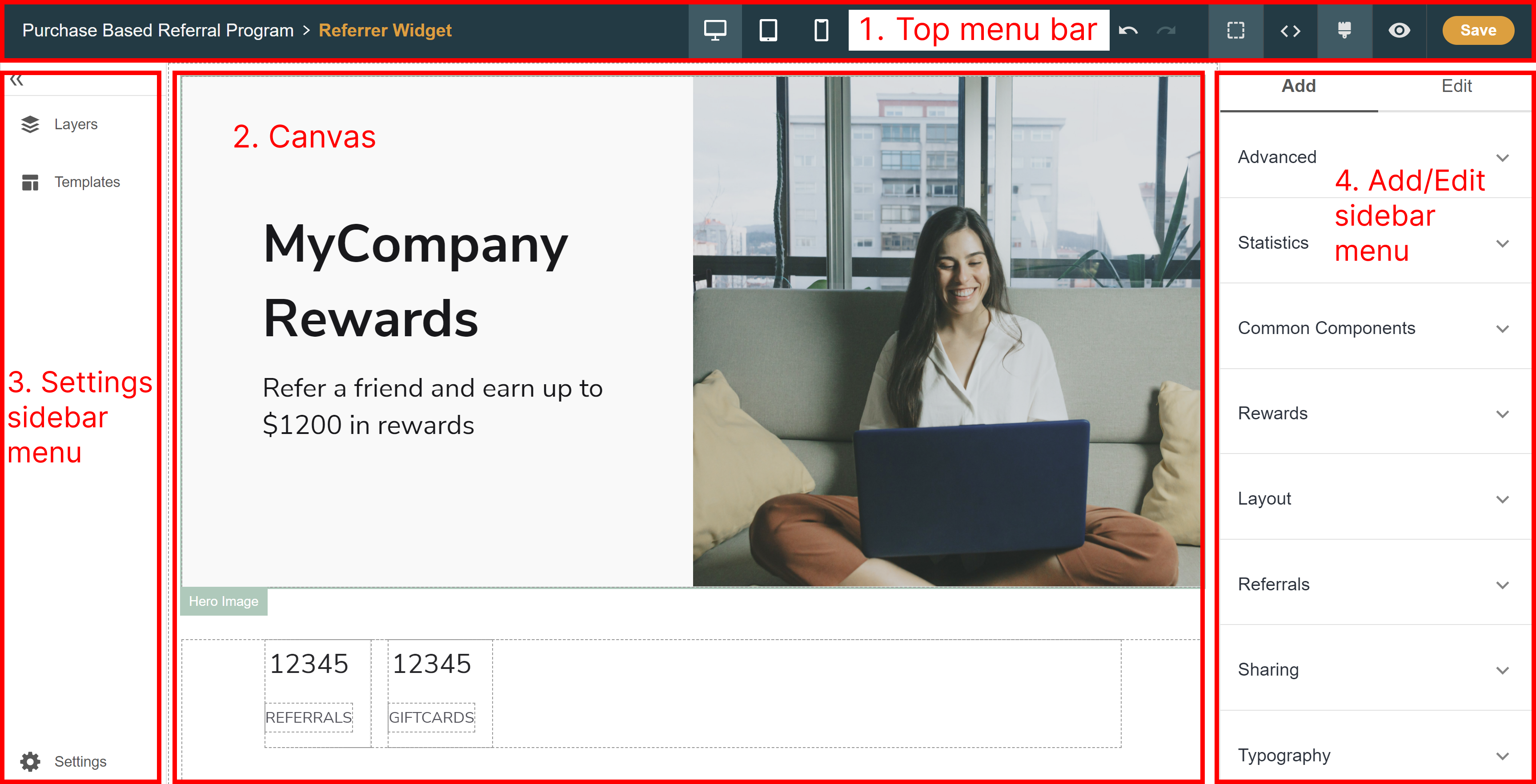
🔗 Top menu bar
The menu bar at the top of the page is where you can undo actions, view the HTML code, and preview the finished widget. Use the desktop, tablet, or mobile icons to see how your widget will appear on devices with different screen sizes.
🔗 Canvas
The canvas shows all of the components that make up your widget. You can click individual components to edit them, or add new ones and see at a glance how they'll show up for your participants.
🔗 Settings sidebar menu
The settings menu is a collapsible panel to the left of the canvas. Here, you can click Layers to see a detailed view of all of the components in your widget, or click Templates to use one of our pre-made widgets. The Settings button takes you to the package installation submenu.
🔗 Add/Edit sidebar menu
The Add/Edit sidebar menu is a panel to the right of the canvas. Use the Add tab to insert new components into the canvas, and use the Edit tab to make adjustments to what's already there.
🔗 Customize your widget
🔗 Step 1: Choose a template
Get started by choosing from one of our template widgets for your referral, loyalty, or combined referral and loyalty program. Visit Participant Experiences. for details about each available template.
- Select Templates from the Settings menu.
- Select Apply template beside to the template you would like to start with.
Note: If you want to preview how the template looks without committing to the change, then you can refresh the page before saving.
🔗 Step 2: Adjust widget content
You can add, edit, move or remove components to modify the content your participants see in the widget.
🔗 Add components
- In the Add menu, click the category of component that you would like to add.
- Click the appropriate component.
- Click the green Add to buton where you want the component to appear on the canvas.
If you add a component and don't like it (or think it would look better elsewhere), then jump ahead to the section on editing and removing components for help.
🔗 Edit components
The properties you can edit will depend on what type of component you selected. For example, if you select the Hero Image component, you’ll be able to select a new image and change the background color. If you select a text-only element like a header, then you can modify the font, text color, and text content.
- Select the component you want to edit.
- Use the options in the Edit menu to change its properties.
Note: If you want to insert a link into a text component, then you can do so by editing the widget’s HTML.
🔗 Move components
Note: Some components can’t be moved. The Move to button will only appear if there’s another valid location on the canvas for the component.
- Within the canvas, select the component you want to move.
- Select [Move].
- Select the green Move to button where you want the component to go.
🔗 Remove components
- Click the component you want to remove in the canvas.
- Click the Trash icon.
🔗 Step 3: Customize widget appearance and theme
🔗 Add images or logos
- From the Add menu, click the Common Components category.
- Click either:
- Overlay (an image with overlaid, editable text)
- Image (a plain image with no text on top)
- From the Edit menu, click the Upload button underneath the Image heading.
🔗 Edit images or logos
- Within the canvas, click the photo you want to change.
- In the Edit menu, click Upload.
- Upload the photo using one of these methods:
- Dragging and dropping the photo
- Browsing for a file on your computer
- Pasting the public URL of the file
- Click Done.
🔗 Adjust which share buttons are shown
You can edit existing share buttons using the Edit menu.
- Select the share button you want to edit on the canvas.
- In the Edit menu, select the name of the site or service under the Share Medium heading.
Add a new share button by using the Add menu.
- From the Add menu, select Sharing.
- Select the appropriate card.
- Select the green Move to button to place the component on the canvas.
🔗 Step 4: Preview and save
🔗 Preview the widget
Preview how the widget will appear to your participants by clicking the eye icon from the top menu bar. You can switch between a preview of the experience for desktop, tablet, or mobile users by clicking the respective device icon.
To return to the editing interface, click the paintbrush icon from the top menu bar.
🔗 Save your changes
WARNING: The widget editor does not autosave your changes. Click Save frequently to make sure you don't lose your work.
When you click Save, the changes will instantly appear in the widget that is presented to your end users—there's no need to make changes to the code on your website or app.
🔗 Troubleshooting
Our widget has two layers of validation to check for errors in component placement and component properties. Common reasons for receiving an error message include:
- Missing a required field
- Choosing an invalid color
- Entering an invalid URL
When you have unresolved errors, a warning message displays at the top right of the canvas that notifies you of how many errors were found.
- Click Details for a brief explanation of what went wrong.
- Go to the component with the error by either:
- Clicking Open Layers
- Clicking the error explanation message
- Find the component with the error. It will be marked with a red exclamation mark icon.
- Click the component to open the properties in the Edit bar.
- Make the required changes.
🔗 Advanced customization options
🔗 Install custom packages
Advanced components allow you to include conditional content that is based on user email, segment, or custom field. For example, if you want to display a leaderboard only for participants who are gold-level subscribers, the conditional section on segment component will let you do so.
You can add advanced components from the Add menu. Setting them up takes a little extra work as you’ll need to enter a JSONata expression in the Condition box that defines the logic for when the condition is met.
- From the Settings menu, click the Settings button.
- Click Add Package.
- Click Add from NPM.
- Enter the package name and file path.
- Click Add.
Clicking Add will allow you to add your components and properties. To push the changes out to your users, click Save in the top menu bar.
🔗 Edit the HTML
You can also edit the HTML or CSS to make further customizations to your widget using the built in HTML editor. While the HTML editor allows for additional flexibility in widget design, keep in mind that the SaaSquatch team is unfortunately unable to troubleshoot any adjustments made with custom HTML or CSS.
- Click the brackets < > icon in the top menu bar.
- Make edits in the code.
- To view the effects of your edits, click the paintbrush icon to return to the widget editing interface.
- Once you're happy with the results, click Save.
🔗 If you need more help
For further assistance with the design and editing of your widgets using the basic customization options, feel free to reach out to our Support team.