Designing Your Program Emails
Your program is initially set up with default versions of program emails to get you up and running as quickly as possible. These default versions are loaded with generic images and messaging to convey the essence of the email. We recommend tailoring your program emails to ensure that the information is relevant to your program and product. See our doc on merge tags for information on how to include participant-specific details in your emails.
🔗 Editor layout
This section will walk you through the various parts of the email editor.
🔗 Contact information
This section allows you to customize the From Name and From Address fields, along with the email's subject line. A BCC can also be added, if you want a copy of this email to be sent to someone other than the participant—for example, a program manager.
If you plan to adjust the From email address, you will need to adjust your settings to ensure that our system is sending authentic emails on your behalf. Instructions can be found on our SaaSquatch & Emails page.
Please Note: All of these fields are required and initially populated with default information.
🔗 Horizontal toolbar

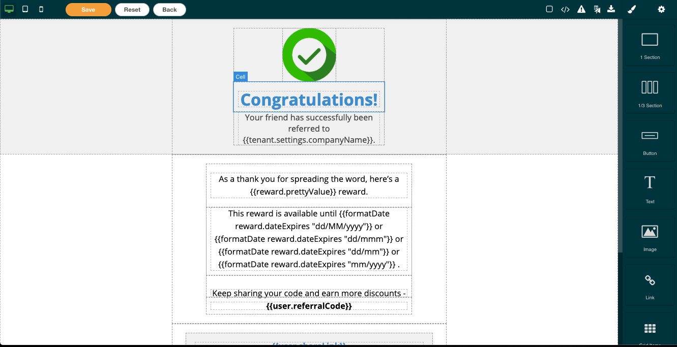
At the top of the editor you'll find the horizontal toolbar that allows you to do the following (from left to right):
- Preview how the email renders on a desktop, tablet or mobile screen.
- Buttons to Save the changes made to the email, Reset back to the default version, or head Back to the Program Settings page.
 View Component boxes to view how the individual components of the email overlay and interact with each other.
 View Code shows the underlying HTML source code for the email. Can be used to export email design.
 Toggle Images previews the email without images. Some users choose to not load images when viewing their emails so you should ensure the email remains readable without images.
 Send Test to send a test copy to an email address you specify. This allows you to see how the email looks when loaded by your email client.
 Import Template to import your own HTML source code for the email. Note that this feature will overwrite anything you have saved into the editor.
🔗 Workspace
This is where the email is previewed and where you will interact with its components.
Text, images, buttons and cells are surrounded by a dotted line to show how they are laid out and interact with each other. You can interact with the components by hovering, clicking and double clicking.
Hovering over a component highlights it in blue and indicates what it is (text, image, cell, etc). This is a great way to see what components may be nested within other components and ones that may rely on others for placement or sizing.
Single clicking highlights the component and brings up a small menu in the upper right-hand of the component itself with four options:
- The Up arrow which will highlight the component higher up in the hierarchy (i.e. It will highlight the cell that contains the text you click the up arrow on).
- The Move button allows you to move the component to a different space. To use: click, hold and drag the move button to move the component to a new spot. A green bar will appear to assist you with placing the component.
- The Duplicate button duplicates the component, placing the newly created duplicate beside the original component.
- The Delete button which deletes the component.
While there is no 'Undo' button, there are two ways to resolve an error:
- The standard “undo” keyboard shortcut: Ctrl-z for Windows PCs and Cmd-z for MacOS.
- The ‘Reset’ button in the Horizontal Toolbar which restores the email to its default state. Clicking this button will erase any and all changes made.
Double clicking the component allows you to adjust the image or text in the component.
🔗 Vertical toolbar
From left to right, the vertical toolbar has four different sections that can be accessed using the four icons at the top.
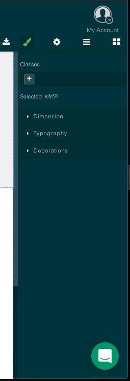
 The first adjusts the styling of the highlighted component. This includes adding classes, adjusting dimensions, text formatting and visual formatting such as borders, backgrounds and colours.
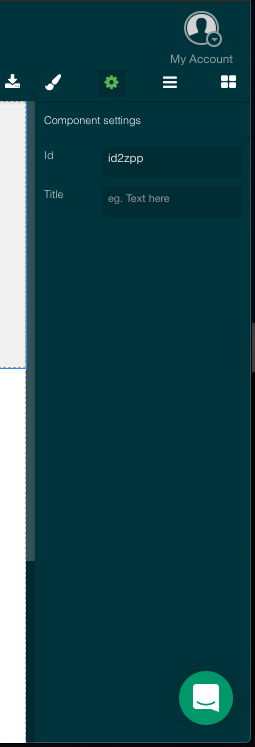
 The second adjusts the settings for the highlighted component including alt text for images or IDs and titles for cells and text boxes.
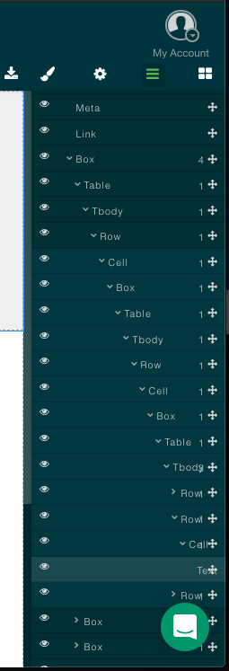
 The third lists all of the components in their hierarchical structure starting with the top
 body tag and going down. You can adjust the level a component is at by clicking and holding on the move icon and dragging the component up or down. Components can also be hidden using the eye icon to the right. Adjusting these settings will adjust any components nested within the component you have highlighted.
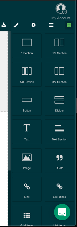
 This provides a list of new components that you can drag and drop into the workspace. You can use this to add additional text, images, links and layout components to your email body.
🔗 Using the editor
If you would like to know how to do something that isn't listed here, please do not hesitate to reach out to our Support Team.
🔗 Add or delete components
All of the images, text, and links in the email are set into individual components that make up the structure of the email. These components are the building blocks of the email.
Note: New components will interact with the existing components in the email which can cause existing text and images to get shifted around. It is usually easier to make changes to existing components by updating an existing image or adding text to existing copy.
🔗 Adding a component
- Select the square section icon in the vertical toolbar to choose a new component.
- Select and drag the component into the area of the email where you want the component to appear. A green bar will appear in the email to help you place the new component in your email.
- [Optional] Adjust the component’s content or appearance using the tools in the vertical toolbar.
- Double-click your new component.
- Select [Edit] in the vertical toolbar.
- If you added a text component, then click the Typography dropdown and change the formatting.
- Save your changes.
🔗 Deleting a component
- In the workspace, select the component you want to delete.
- Select [Delete] to delete the component from the email.
- Save your changes.
🔗 Update the email copy
Email copy is divided into text components that are managed in different sections of the email.
- Add a new text component or double-click to highlight an existing component.
- Adjust the text in the component.
- With the text component highlighted, select [Settings] in the vertical toolbar to make changes to the text’s font, color, weight or spacing.
- After your updates are done, send yourself a test email.
- If the test email looks good, save your changes.
🔗 Add a custom image
- Add a new image component or highlight the component that you want to update.
- Once the component is selected, double-click it to bring up the Select Image window. select the Add Images to select the image that you would like to use. Once the image has loaded in the Select Image window, double-click it to add it to the new component.
- Adjust the size and location of the image using the selectors in the Workspace.
- After your updates are done, send yourself a test email.
- If the test email looks good, save your changes.
🔗 Add dynamic content
Merge tags allow you to add dynamic content, like the participant’s name or amount rewarded, to the email copy. You can add a merge tag to any text component.
Note: If there is no information that corresponds to the merge tag you're using, then participants will see an extra space in the email text. For instance, if you use "Hello {{user.firstName}}. How are you? in your email but the user did not have data in the firstName field, the email would render as "Hello . How are you?".
- Select a merge tag from our merge tags list.
- In the Workspace, double-click the text to which you want to add a merge tag.
- Add the merge tag. Be sure to preserve the structure of the tag. It should be two "handlebar" brackets followed by the contents of the tag, followed with another two "handlebar" brackets in the opposite direction. As an example:
{{user.firstName}}. - Save your changes.
A test email sent within the editor will not include any values where the merge tags have been placed.
🔗 Import a custom-built email
The email editor can accept any HTML-formatted email code, and you can import any HTML-based email that has been created for you.
Importing an email will overwrite any other changes you’ve made. If you want to make a copy of those changes, select the View Code button and save the code to another file or location.
- Click on [Import Template] in the horizontal toolbar to open the import window.
- Add your script into the Import Template window. Review the copied code for accuracy and completeness.
- Select the Import button to load the custom code into the email editor.
- Review the rendered preview in the Workspace to ensure there are no errors.
- Note: It is possible to make changes using the Workspace and Vertical Toolbar but larger issues require you to make changes to the code itself and re-import it. You cannot edit the code directly in the editor.
- After your updates are done, send yourself a test email.
- If the test email looks good, save your changes.
🔗 If you need help...
If you need any help editing your program emails, please reach out to our Support Team for further assistance.